Creating a dynamic logo that responds to user scrolling is a popular web design technique that enhances user experience and adds visual polish to websites. This effect typically involves shrinking a large logo in the header as users scroll down, making more room for content while maintaining brand visibility.
The Showit Code Snippet
To make your logo grow or shrink in Showit, we will use a combination of Javascript, and take advantage of the “Class Selectors” feature of Showit.
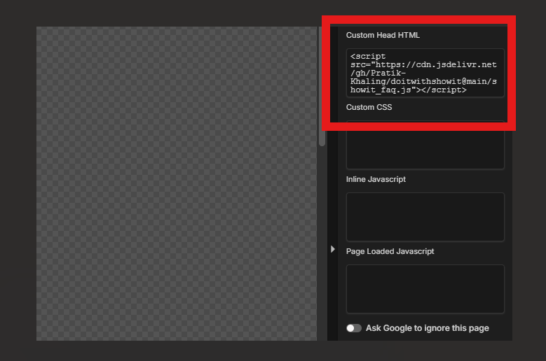
First, add the following code to the <head> section of your page
<script src="https://cdn.jsdelivr.net/gh/Pratik-Khaling/doitwithshowit@main/intersection-observer.js" defer></script>
<script src="https://cdn.jsdelivr.net/gh/Pratik-Khaling/doitwithshowit@refs/heads/main/scroll-to-grow.js" defer></script>
What does this Showit code snippet do?
It adds the necessary javascript to activate the growing and shrinking animation and binds the logo you select through the ‘class selectors’.
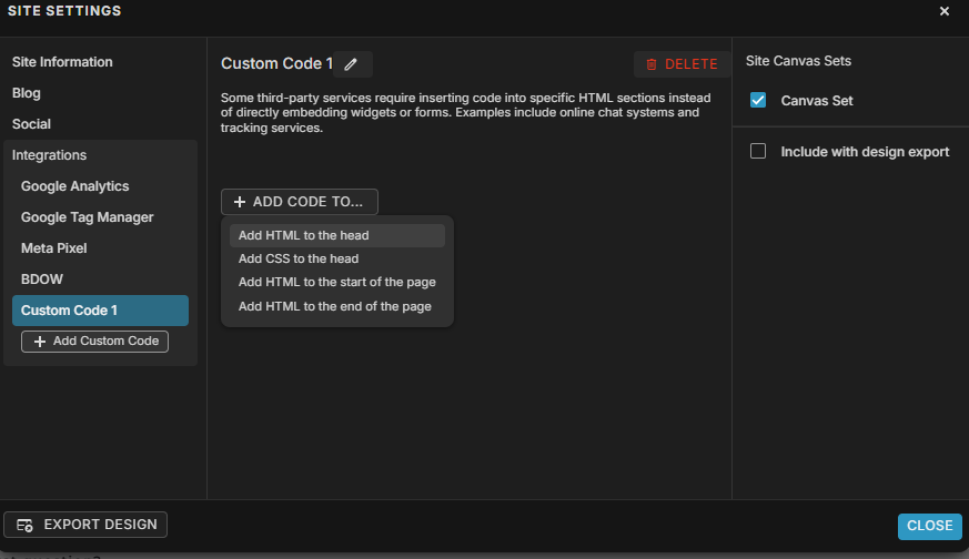
Where to Add the Code in Showit
If you are using a canvas set:
Go to Site settings → Integration → Custom Code → Add custom HTML to the head of your page.
If you are not using a canvas set:
Use the Advanced settings → Custom Head HTML box in the right-hand pane.
How to select your logo
This works for images and text boxes!
Simply click on your logo, click on Advanced Options and under Class Selectors, add these 2 classes:
observe
scr-grow
Determining initial and final scale
Once you have selected your logo, we will add another classname with the initial and final scale as parameters
scale-xx-yy
Where xxx is the initial scale and yy is the final scale.
If you want the logo to grow, use something like scale-20-120
Or, if you want the logo to shrink, use something like scale-140-40
Play around with the values and see what works best for you!
In Summary
Creating a dynamic, scroll-responsive logo in Showit is straightforward with this code snippet approach. By adding the provided JavaScript files to your site’s head section and applying the correct class selectors (observe, scr-grow, and scale-xx-yy) to your logo element, you can achieve professional-looking animations that enhance user experience. The beauty of this solution lies in its flexibility—you can easily adjust the scaling values to create either growing or shrinking effects, and it works with both images and text elements. This technique adds a modern, polished touch to your website while maintaining optimal use of header space as visitors scroll through your content.