
A hover effect is one of the simplest and most basic styling and customization options for a button. Unfortunately, due to the system that is used in ShowIt builder to create buttons, this effect is not possible – well, at least not fully.
If you are familiar with ShowIt, a button is created in two steps. First, we add a text box with the button text on it, and then secondly, we add a rectangle behind the box, as the ‘background’ of the button.
This creates a problem for the hover effect. Sure, ShowIt has an inbuilt hover effect that we can employ to change the color of the rectangle on hover, but as your mouse pointer hovers over the button text, the hover effect disappears – the rectangle reverts to its original color. This happens because you are no longer hovering over the rectangle, but are now hovering over the text box.
This tutorial will show you how you can create a button with a proper hover effect.
(without the drawbacks of your traditional ShowIt button.)
While this tutorial does require you to dabble a bit with custom CSS, we assure you that it’s extremely easy and we’ll guide you step-by-step.
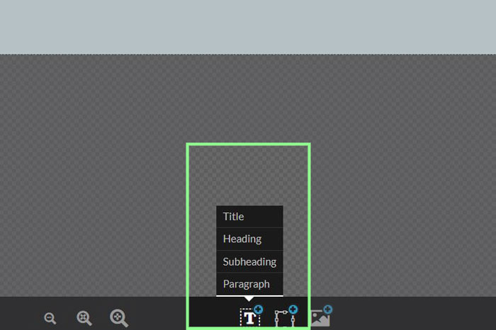
Step 1: Add a text box.
Click on the “T” icon at the bottom bar of your ShowIt builder and add a text box. We have used a subheader box in our tutorial, but you do you!
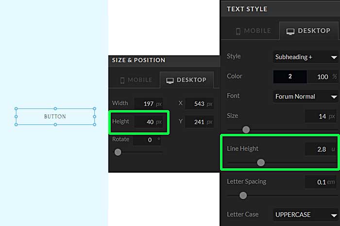
Step 2: Name, size, and styling
Name your button. We have named it ‘BUTTON’ for this tutorial.
Go over to your size and position menu, and change the height of the button to your desired height, we have set it to 40px.
Style your text – choose your fonts, colors, and text size. Pay special attention to the line height option. Adjust your line height to the point where it aligns your button text vertically inside the text box. You might have to change the line height according to the font you are using, and the height you have set for your button.
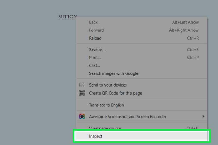
Step 3: Find the class name
ShowIt automatically assigns a class name to every module you add to the page.
A class attribute in HTML is used to specify a class for an HTML element. We can leverage this class name to apply custom CSS and JavaScript to the element in order to customize it.
Let’s find the class name of the button we have just created and use that to style it to our liking. To do this, preview your page and click on the link that comes up. This will open the page on a new tab. On that page, right-click on the button, and click on “Inspect”.
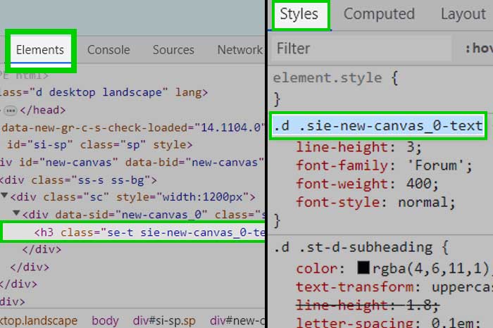
Step 4: Copy the class name
Clicking on Inspect opens the Chrome Developer Tools window, or the DevTools window, as Google likes to call it. The DevTools window opens docked to the bottom of your browser screen by default, but depending on your settings, it might be docked to the left or the right, or it might open up as an independent window altogether.
Once the window opens up, make sure you are under the Elements tab. You will see that the button element is already highlighted. Look over to the right-hand side, and you will see another box that has the CSS styles listed under the Styles tab. The first one that starts with a “.d” is your class name. Clicking on that will highlight the entire class name, and all you need to do is hit Ctrl + C for copying the class name.
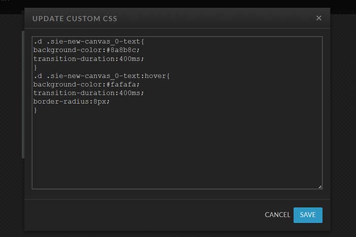
Step 5: Add the CSS
Switch back to your builder. Make sure you are on the page where you have created your button. Go over to the Advanced Settings on your right-hand side and expand it.
Click the box that is labeled Custom CSS, which will open a small text editor. In that editor, enter the following code:
.d .yourclassname{
background-color:#yourhexcode;
transition-duration:400ms;
}
.d .yourclassname:hover{
background-color:#yourhexcode;
transition-duration:400ms;
border-radius:8px;
}
Note that when writing CSS code, class names are targeted by using a period(.) punctuation mark in CSS. In both sets of CSS code, replace the text “.d .yourclassname” with the class name of your button from Step 4.
*Important Note:
After you create your button, if you add a new text box inside the same canvas, it will result in a change in the classname of your button text box. Therefore, we recommend that you create your hover effects after everything has been finalized in the webiste and you do not need to add anything more. If you do happen to add another text box, follow steps 3, 4 and 5 to get the new class name and replace the old one in your CSS code.
That’s basically it! And here are a few notes:
- You can create as many buttons as you want on your page. Just make sure to find and copy their class names by following Steps 3 and 4, and all you need to do is add those class names separated by a comma in the code given in Step 5. For example,
.d .classname1, .d.classname2, .d .classname3{
background-color:#8a8b8c;
transition-duration:400ms;
}
.d .classname1:hover, .d.classname2:hover, .d .classname3:hover{
background-color:#fafafa;
transition-duration:400ms;
border-radius:8px;
}
Don’t forget to add a space after the comma. - If you do not want the button to have rounded corners on hover, remove the line “border-radius:8px;” from the code.
- You can adjust the time taken for the effect to transition to your liking by adjusting the “transition-duration” line of CSS. We have used 400 milliseconds, but you can play around with that value – see what works best for you functionally and visually.
- Remember, if you add buttons to another page, the CSS will have to be added to that page as well.
And that’s it, folks!
If you liked the post, share it with your fellow ShowIt designers and developers. You can leave a comment if you have questions/suggestions.
Follow me on Instagram
Thank you so much, this has helped me a lot. Is there a way to make it work on the mobile version? Thanks in advance!
Hover effects on buttons or elements are designed for cursor-based interactions and don’t directly apply to touch-based devices like mobile phones or tablets. Since mobile devices use touch gestures instead of a cursor, hover effects might not work as expected. To enhance mobile user experience, you can utilize CSS media queries to apply specific styles for smaller screens or employ JavaScript to create touch-based interactions that simulate hover effects. However, implementing these features on mobile may require more detailed coding beyond the scope of this explanation.
If you’re interested in incorporating such functionality into your website’s mobile version, feel free to reach out to me here